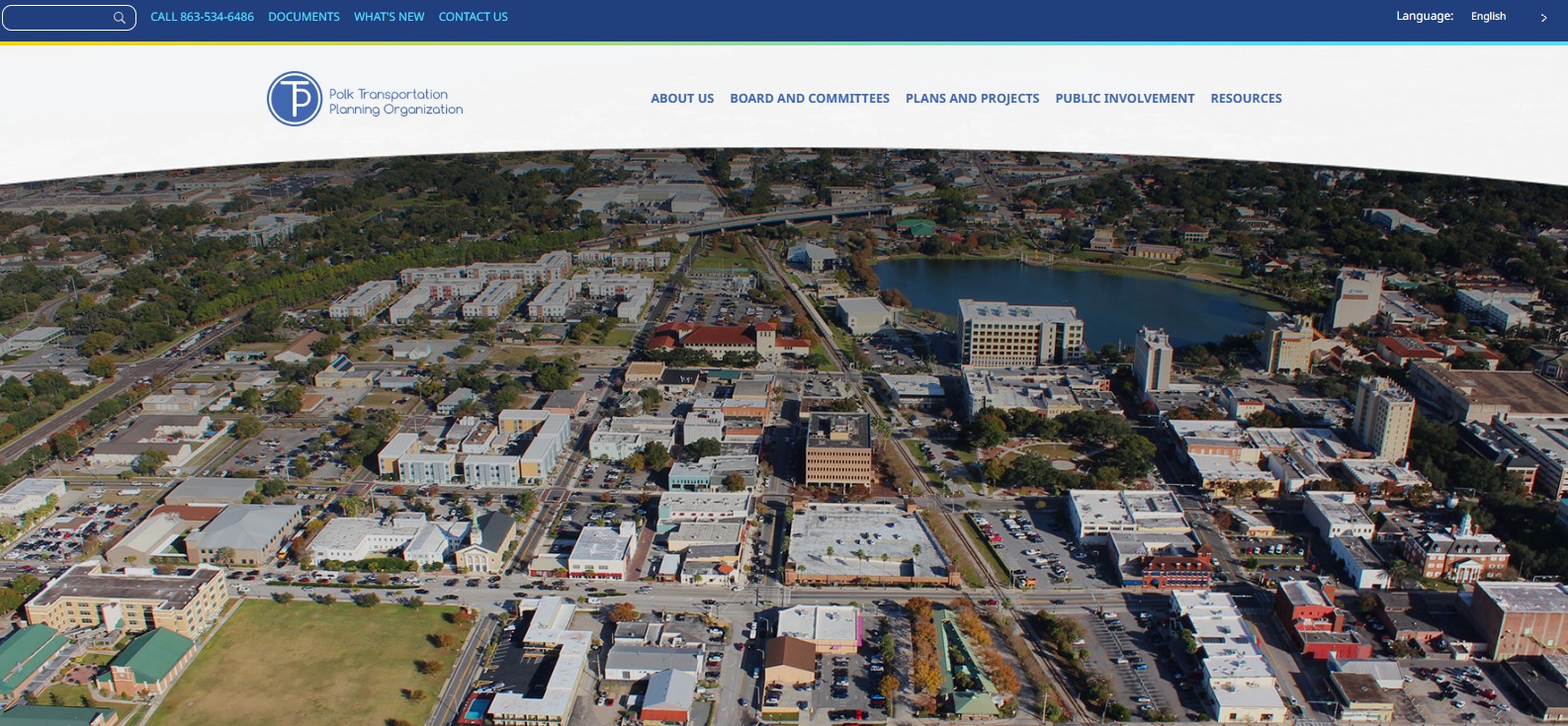
The Challenge
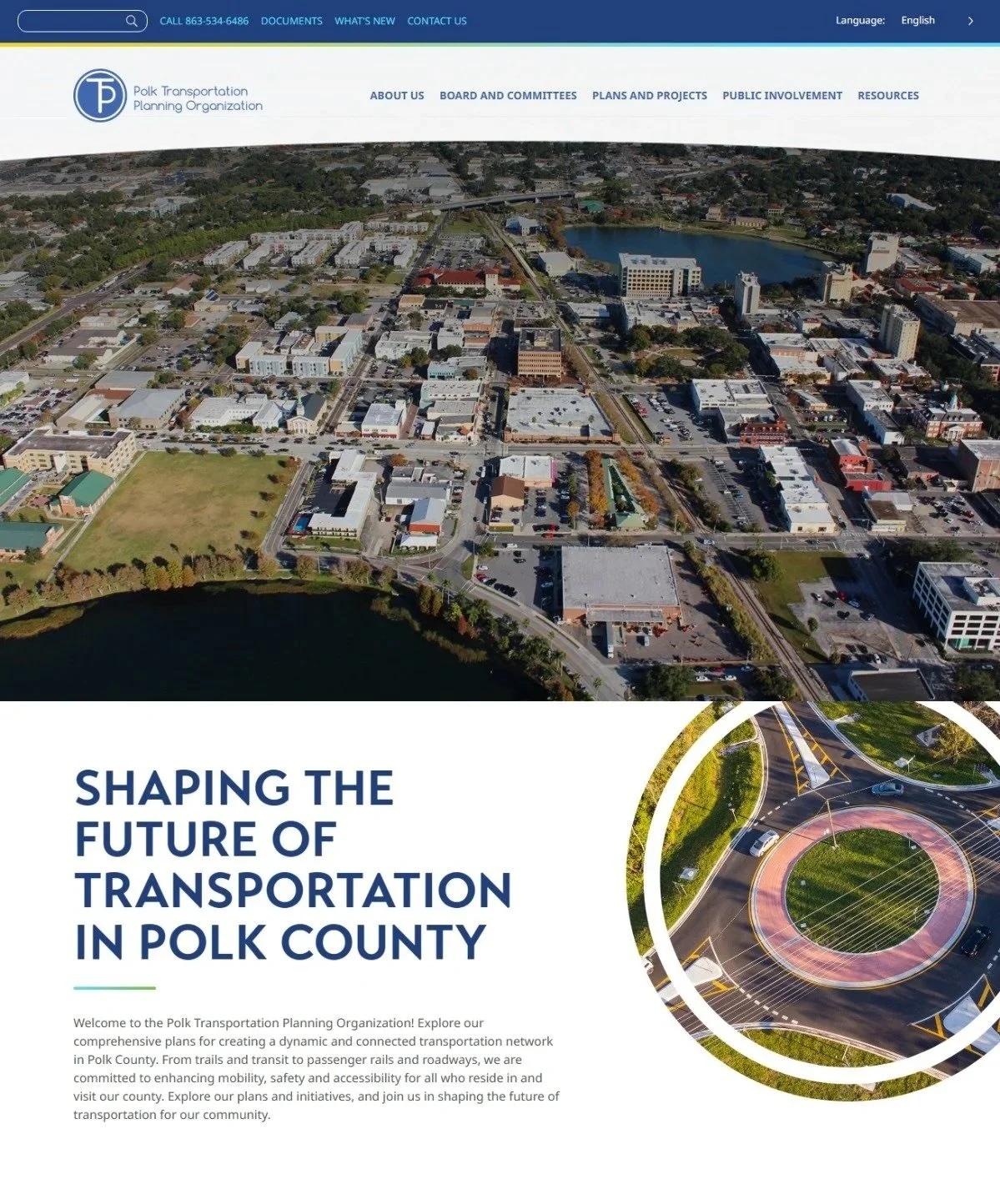
The Polk TPO's website was the organization's front door for residents, partners, and public officials — but it no longer reflected the TPO's mission or made its work easy to find. Content was hard to navigate, the brand felt dated, and important planning information was buried.
The organization needed more than a facelift: a full rebrand and rebuild that would communicate the TPO's mission and services with clarity, and hold up as the team kept publishing new plans and projects.
The Strategy
As Project Manager, I owned the initiative from concept to launch — setting the direction, establishing the standards, and keeping every contributor aligned around a single vision.
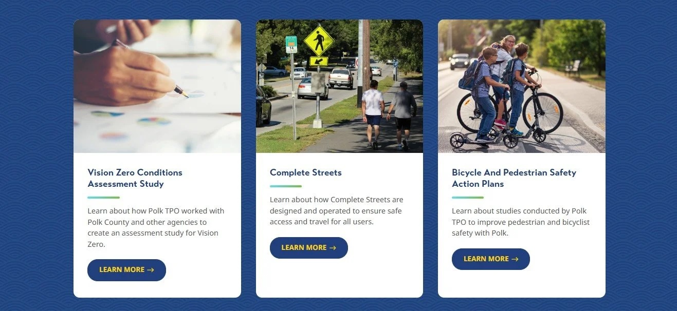
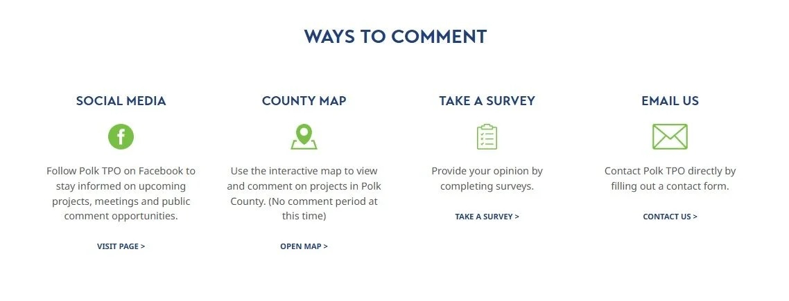
- Strategic site map. A restructured information architecture that made the TPO's services and plans easy to discover.
- Cohesive branding standards. A refreshed visual identity applied consistently across every page and template.
- Clear, engaging copy. Messaging that explained the TPO's mission and services with precision and warmth.
- SEO from the ground up. Best practices built into structure and content to boost visibility and outreach.
The Execution
I served as the primary liaison between leadership, developers, and content contributors — translating goals into requirements, keeping the build on track, and ensuring seamless alignment across teams. After launch, I managed ongoing updates so the site stayed accurate, performant, and relevant as the organization evolved.
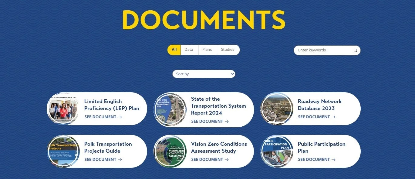
Beyond making planning documents easy to locate, I contributed engaging news and blog content that connected visitors to the TPO's planning efforts — giving residents a reason to explore the site and stay informed, not just a place to search for a PDF.
A public agency's website is a promise of transparency — I rebuilt the TPO's so that finding the right information felt effortless.